Project Background
To share my learning from this project, I first need to tell you a little bit about how it all started. In fact, it began with a series of ‘Firsts’.
- First auto finance provider to pioneer Digitisation across its services in Singapore
- First exposure to software development and UX for Orchard Credit
- First online presence for Orchard Credit’s established Car Finance business
The Kick-off
As you may have guessed, there was a lot for both teams to get up to speed with! We ran a series of collaborative workshops to rapidly understand the business, its users, and to determine the best technology.
The outcome of the workshops was a prioritised list of features, user roles, and key metrics to measure the success of a Minimum Viable Product (MVP).
Lesson 1.
It is important for every team to be on the same page. but make sure you pick a page that everyone can understand!
During the kick-off, it became apparent that helping the client to understand UX Design and Agile Development had mutual benefits. The shared learning fostered an open and honest relationship, whilst providing the opportunity for our team to work closely with the domain experts.
It seemed such a simple thing to do, de-mystify the jargon, make things simple and more accessible...after all, is that not the responsibility of a UX Designer?
On a side note, the experience was little bit of a 💡 light bulb moment for me. Working this way seemed to make things a tonne easier and positively affected the product. It certainly changed my approach to UX and I'd consider it one of the main factors that convinced me to begin teaching UX at General Assembly.
"I enjoyed the way it gave us a window into a world that can sometimes feel very complicated. It made things simple and understandable and it felt like we were on the same page."
Early Challenges
In one of the efforts to simplify the project, we broke the MVP down into a series of User Stories. The stories made the development process more relatable. However, we immediately recognised that discussion about the product's Design lacked focus. Collectively we acknowledged there was not enough empathy for the users or their pain points 😫.
Lesson 2.
ALWAYS, ALWAYS, ALWAYS ASK:
“HANG ON A MINUTE…WHO ARE WE MAKING
THIS FOR?”
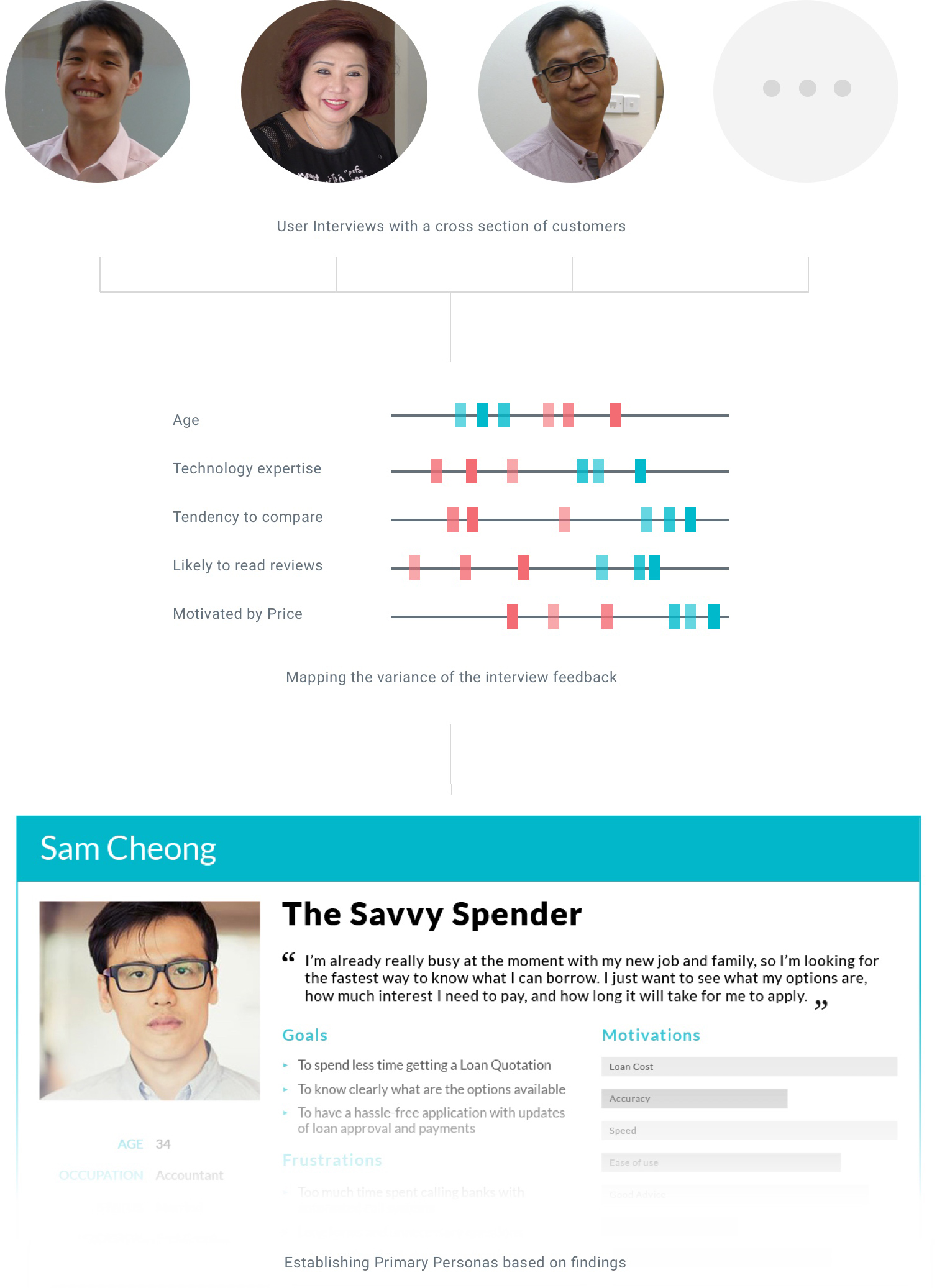
We needed to take a small step back and re-align around the intended users. To do this, a number of customers at different stages of the sales process were interviewed. Their input was collated and mapped to determine variance. From the results, we produced primary personas for each role in the system. The decision making of the full team was now strongly reframed around each Persona.
Persona Development
The Problem
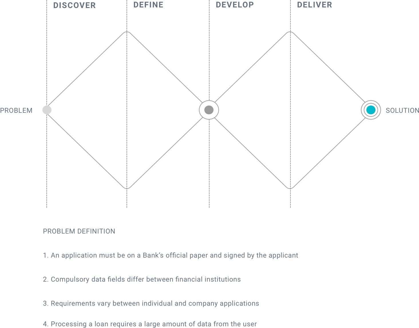
Due to the innovative nature of the project, we encountered a number of issues that challenged the product’s success. For example, at this time in Singapore, a loan application must be completed on a Bank’s official paper form. This directly impacted many of our ideas to drive Digital efficiency into the process.
Lesson 3.
Isolate the moments OF truth and high risk areas for the experience.
We required a method to efficiently manage the continuous periods of discovery and Design. The team agreed to maintain a structured double diamond process of problem definition, prioritisation, and solution feasibility review. This approach ensured we identified areas of risk early and concentrated our UX efforts accordingly.
Put simply, we saved a lot of time by solving the right problem at the right moment.
The Solution
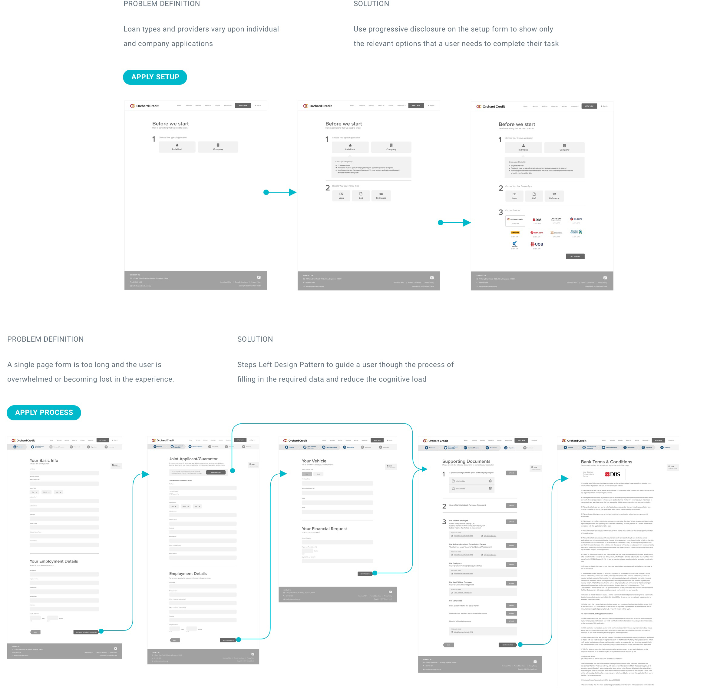
The early phases of the project encompassed three portals, with multiple user roles for Customers, Car Dealerships, and the Internal Team. Insights gathered from the problem definition activities and User Research guided the UX Design.
Interactive wireframes, along with calculation models, were chosen to represent the project's source of truth. This simple approach to the Design Detailing allowed the team to manage the complexity of interrelated portals and react quickly to change.
Our team also ran a number of supporting processes to communicate the solution to all parties involved, including: Business Process Mapping, Data Definition, User Flow Diagramming, UI Design and Rapid Prototyping.
Designing the user flow
Visual Design
To deliver the User Interface for the MVP, the team reviewed the existing brand and made recommendations for using it online. Marketing pages were added to the Customer Portal to help users understand the services, as well as calculate their budget and apply for finance.
The UI design was based upon the preferences of our Personas; it focused on easy to use controls with large tap gestures and dynamic images that, 'place the user at the driving seat of the experience.'

Lesson 4.
Prioritising touchpoints is good but don't forget about the rest of the system
Most of the Visual Design time was invested in the Customer Portal at the early stages of the product. Our team created the wireframes with an atomic structure but as soon the UI work was completed, issues began to arise. With multiple developers working on different templates, components became inconsistent, the code was inefficient and overall, everyone became frustrated with the UI! 😤.
We rectified the problem by agreeing a basic style guide, but my recommendation on all future projects is to start by establishing a Design System. It is critical there is a shared language that everyone can contribute to and a Design System simply prevents confusion.
Lesson 5.
Everyone makes mistakes. It’s how you handle the errors that matters!
Usability testing
The UX team were heavily involved in testing at every development milestone. This visibility ensured we stayed close to product prior to release and supported immediate refinement of the experience. We also helped to manage the user acceptance criteria and conducted a series of user testing sessions, continuously recording observations and making future state recommendations.
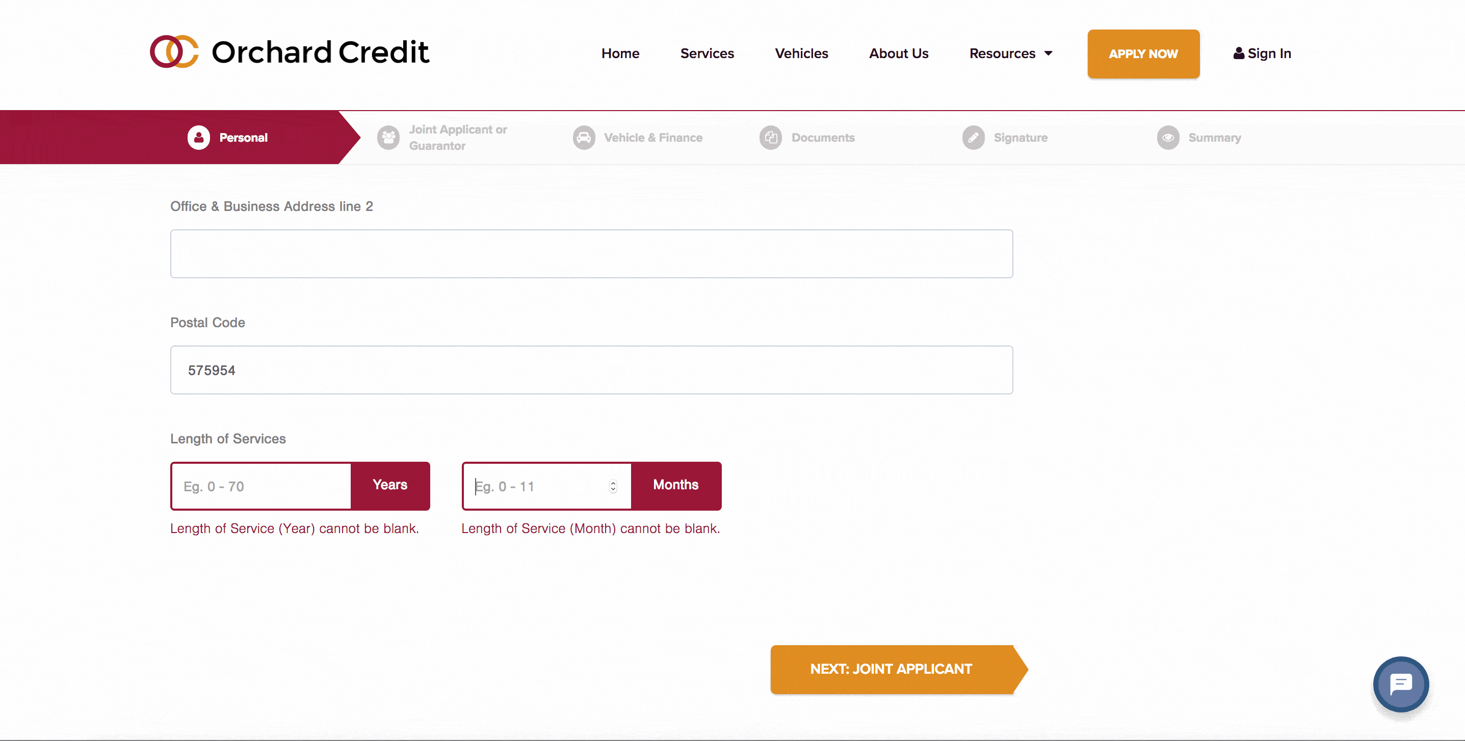
During one such lean testing session, we noticed that users became stuck moving to the next page of the application form. The validation indicated the compulsory fields but the user was too far down the page to notice the error! We quickly improved the MVP by scrolling to the first error field on page that required the user’s attention.
User testing brought a spotlight on critical areas of the product, such as error handling. Different solutions were discussed with the team and MoSCoW priority used to plan the solution roadmap 🚗.
The Results
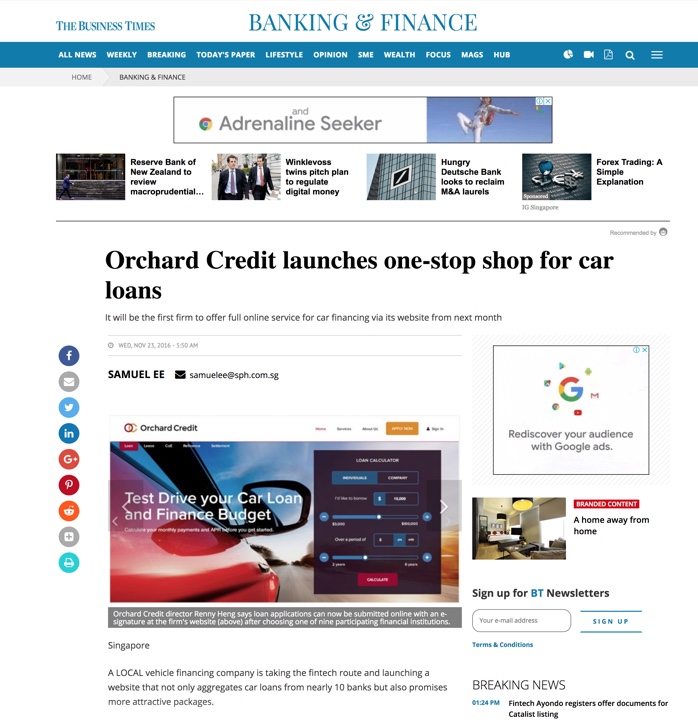
Our team successfully completed the MVP and the launch was featured in the print and online version of the Singapore Business Times. Subsequently, we delivered further phases of the project featuring pre-owned vehicles and online payments.
ESTIMATED
131%
RETURN ON INVESTMENT
During the first 6 months, it was estimated that
the product delivered a 131% ROI, and a higher than expected performance on all key metrics, including:
- Percentage of Customers independently calculating and applying for loans online
- Time spent completing & processing Applications
- Unique Users vs New Applications